自定义应用程序的外观和感觉
Backstage 随附一个默认主题,并有浅色和深色两种模式可供选择。 这些主题作为@backstage/theme软件包,其中还包括用于定制默认主题或创建全新主题的实用程序。
创建自定义主题
创建新主题的最简单方法是使用createTheme函数导出的@backstage/theme你可以用它来覆盖默认主题的一些基本参数,如调色板和字体。
例如,你可以在默认轻量级主题的基础上创建一个新主题,就像这样:
import { createTheme, lightTheme } from '@backstage/theme';

const myTheme = createTheme({
  palette: lightTheme.palette,
  fontFamily: 'Comic Sans MS',
  defaultPageTheme: 'home',
});
如果想对主题进行更多控制,例如自定义字体大小和页边距,可以使用较低级别的createThemeOverrides函数导出的@backstage/theme与创建主题从@material-ui/core请参阅下面的 "覆盖Backstage和 Material UI css 规则 "部分。
您还可以从头开始创建一个与BackstageTheme由@backstage/theme见Material UI 主题文档以获取更多关于如何做到这一点的信息。
使用自定义主题
要在 Backstage 应用程序中添加自定义主题,可将其作为配置传递给createApp.
例如,添加我们在上一节创建的主题就可以这样做:
import { createApp } from '@backstage/app-defaults';
import { ThemeProvider } from '@material-ui/core/styles';
import CssBaseline from '@material-ui/core/CssBaseline';
import LightIcon from '@material-ui/icons/WbSunny';

const app = createApp({
  apis: ...,
  plugins: ...,
  themes: [{
    id: 'my-theme',
    title: 'My Custom Theme',
    variant: 'light',
    icon: <LightIcon />,
    Provider: ({ children }) => (
      <ThemeProvider theme={myTheme}>
        <CssBaseline>{children}</CssBaseline>
      </ThemeProvider>
    ),
  }]
})
请注意,您的自定义主题列表会覆盖默认主题。 如果您仍想使用默认主题,它们会作为lightTheme和darkTheme从@backstage/theme.
自定义主题示例
import {
  createTheme,
  genPageTheme,
  lightTheme,
  shapes,
} from '@backstage/theme';

const myTheme = createTheme({
  palette: {
    ...lightTheme.palette,
    primary: {
      main: '#343b58',
    },
    secondary: {
      main: '#565a6e',
    },
    error: {
      main: '#8c4351',
    },
    warning: {
      main: '#8f5e15',
    },
    info: {
      main: '#34548a',
    },
    success: {
      main: '#485e30',
    },
    background: {
      default: '#d5d6db',
      paper: '#d5d6db',
    },
    banner: {
      info: '#34548a',
      error: '#8c4351',
      text: '#343b58',
      link: '#565a6e',
    },
    errorBackground: '#8c4351',
    warningBackground: '#8f5e15',
    infoBackground: '#343b58',
    navigation: {
      background: '#343b58',
      indicator: '#8f5e15',
      color: '#d5d6db',
      selectedColor: '#ffffff',
    },
  },
  defaultPageTheme: 'home',
  fontFamily: 'Comic Sans MS',
  /* below drives the header colors */
  pageTheme: {
    home: genPageTheme({ colors: ['#8c4351', '#343b58'], shape: shapes.wave }),
    documentation: genPageTheme({
      colors: ['#8c4351', '#343b58'],
      shape: shapes.wave2,
    }),
    tool: genPageTheme({ colors: ['#8c4351', '#343b58'], shape: shapes.round }),
    service: genPageTheme({
      colors: ['#8c4351', '#343b58'],
      shape: shapes.wave,
    }),
    website: genPageTheme({
      colors: ['#8c4351', '#343b58'],
      shape: shapes.wave,
    }),
    library: genPageTheme({
      colors: ['#8c4351', '#343b58'],
      shape: shapes.wave,
    }),
    other: genPageTheme({ colors: ['#8c4351', '#343b58'], shape: shapes.wave }),
    app: genPageTheme({ colors: ['#8c4351', '#343b58'], shape: shapes.wave }),
    apis: genPageTheme({ colors: ['#8c4351', '#343b58'], shape: shapes.wave }),
  },
});
有关包括Backstage和 Material UI 组件重载在内的自定义主题的更完整示例,请参见光圈主题从Backstage演示网站.
覆盖Backstage和 Material UI 组件样式
创建自定义主题时,您需要将不同的值应用到使用主题对象的组件 css 规则中。 例如,Backstage组件的样式可能如下所示:
const useStyles = makeStyles<BackstageTheme>(
  theme => ({
    header: {
      padding: theme.spacing(3),
      boxShadow: '0 0 8px 3px rgba(20, 20, 20, 0.3)',
      backgroundImage: theme.page.backgroundImage,
    },
  }),
  { name: 'BackstageHeader' },
);
请注意padding的值来自theme.spacing也就是说,在自定义主题中设置间距值会影响该组件的 padding 属性,同样的道理也适用于backgroundImage它使用theme.page.backgroundImage但是boxShadow属性不引用主题中的任何值,这意味着创建一个自定义主题不足以更改box-shadow属性,或添加尚未定义的 css 规则(如 margin)。 在这些情况下,您还应创建一个重载。
import { createApp } from '@backstage/core-app-api';
import { BackstageTheme, lightTheme } from '@backstage/theme';
/**
 * The `@backstage/core-components` package exposes this type that
 * contains all Backstage and `material-ui` components that can be
 * overridden along with the classes key those components use.
 */
import { BackstageOverrides } from '@backstage/core-components';

export const createCustomThemeOverrides = (
  theme: BackstageTheme,
): BackstageOverrides => {
  return {
    BackstageHeader: {
      header: {
        width: 'auto',
        margin: '20px',
        boxShadow: 'none',
        borderBottom: `4px solid ${theme.palette.primary.main}`,
      },
    },
  };
};

const customTheme: BackstageTheme = {
  ...lightTheme,
  overrides: {
    // These are the overrides that Backstage applies to `material-ui` components
    ...lightTheme.overrides,
    // These are your custom overrides, either to `material-ui` or Backstage components.
    ...createCustomThemeOverrides(lightTheme),
  },
};

const app = createApp({
  apis: ...,
  plugins: ...,
  themes: [{
    id: 'my-theme',
    title: 'My Custom Theme',
    variant: 'light',
    Provider: ({ children }) => (
      <ThemeProvider theme={customTheme}>
        <CssBaseline>{children}</CssBaseline>
      </ThemeProvider>
    ),
  }]
});
自定义徽标
除了自定义主题外,您还可以自定义网站左上角显示的徽标。
在前端应用程序中,找到src/components/Root/您会发现两个组件:
LogoFull.tsx- 打开侧边栏导航时使用的较大徽标。LogoIcon.tsx- 关闭侧边栏导航时使用的较小徽标。
要替换图片,只需用原始 SVG 定义替换这些组件中的相关代码即可。
您也可以通过导入 PNG 等其他网络图像格式来使用。 为此,请将新图像放入一个新的子目录,如src/components/Root/logo/my-company-logo.png然后添加以下代码:
import MyCustomLogoFull from './logo/my-company-logo.png';

const LogoFull = () => {
  return <img src={MyCustomLogoFull} />;
};
图标
到目前为止,你已经了解了如何创建自己的主题和添加自己的徽标,下面将向你介绍如何覆盖现有图标以及如何添加更多图标
自定义图标
您还可以自定义项目的_默认_图标
您可以更改以下内容图标.
要求
- 以
.svg格式提供的文件 * 为图标创建的 React 组件
创建 React 组件
在前端应用程序中,找到src我们建议创建assets/icons目录和CustomIcons.tsx锉刀
另一个例子 这里,如果你想确保在浅色和深色主题中的正确行为。
import { SvgIcon, SvgIconProps } from '@material-ui/core';

import React from 'react';

export const ExampleIcon = (props: SvgIconProps) => (
  <SvgIcon {...props} viewBox="0 0 24 24">
    <path
      fill="currentColor"
      width="1em"
      height="1em"
      display="inline-block"
      d="M11.6335 10.8398C11.6335 11.6563 12.065 12.9922 13.0863 12.9922C14.1075 12.9922 14.539 11.6563 14.539 10.8398C14.539 10.0234 14.1075 8.6875 13.0863 8.6875C12.065 8.6875 11.6335 10.0234 11.6335 10.8398V10.8398ZM2.38419e-07 8.86719C2.38419e-07 10.1133 0.126667 11.4336 0.692709 12.5781C2.19292 15.5703 6.3175 15.5 9.27042 15.5C12.2708 15.5 16.6408 15.6055 18.2004 12.5781C18.7783 11.4453 19 10.1133 19 8.86719C19 7.23047 18.4498 5.68359 17.3573 4.42969C17.5631 3.8125 17.6621 3.16406 17.6621 2.52344C17.6621 1.68359 17.4681 1.26172 17.0842 0.5C15.291 0.5 14.1431 0.851562 12.7775 1.90625C11.6296 1.63672 10.45 1.51562 9.26646 1.51562C8.19771 1.51562 7.12104 1.62891 6.08396 1.875C4.73813 0.832031 3.59021 0.5 1.81687 0.5C1.42896 1.26172 1.23896 1.68359 1.23896 2.52344C1.23896 3.16406 1.34188 3.80078 1.54375 4.40625C0.455209 5.67188 2.38419e-07 7.23047 2.38419e-07 8.86719V8.86719ZM2.54521 10.8398C2.54521 9.125 3.60208 7.61328 5.45458 7.61328C6.20271 7.61328 6.91917 7.74609 7.67125 7.84766C8.26104 7.9375 8.85083 7.97266 9.45646 7.97266C10.0581 7.97266 10.6479 7.9375 11.2417 7.84766C11.9819 7.74609 12.7063 7.61328 13.4583 7.61328C15.3108 7.61328 16.3677 9.125 16.3677 10.8398C16.3677 14.2695 13.1852 14.7969 10.4144 14.7969H8.50646C5.72375 14.7969 2.54521 14.2734 2.54521 10.8398V10.8398ZM5.81479 8.6875C6.83604 8.6875 7.2675 10.0234 7.2675 10.8398C7.2675 11.6563 6.83604 12.9922 5.81479 12.9922C4.79354 12.9922 4.36208 11.6563 4.36208 10.8398C4.36208 10.0234 4.79354 8.6875 5.81479 8.6875Z"
    />
  </SvgIcon>
);
使用自定义图标
在packages/app/src/App.tsx
import { ExampleIcon } from './assets/customIcons'

const app = createApp({
  apis,
  components: {
    {/* ... */}
  },
  themes: [
    {/* ... */}
  ],
  icons: {
    github: ExampleIcon,
  },
  bindRoutes({ bind }) {
    {/* ... */}
  }
})
添加图标
您可以添加更多图标,如果默认图标的图标,以便将它们用于其他地方,如实体中的链接。 在本例中,我们将使用来自Material UI特别是AlarmIcon下面介绍如何做到这一点:
- First you will want to open your
App.tsxin/packages/app/src2. Then you want to import your icon, add this to the rest of your imports:import AlarmIcon from '@material-ui/icons/Alarm';3. Next you want to add the icon like this to yourcreateApp:tsx title="packages/app/src/App.tsx" const app = createApp({ apis: ..., plugins: ..., /* highlight-add-start */ icons: { alert: AlarmIcon, }, /* highlight-add-end */ themes: ..., components: ..., });4. Now we can referencealertfor our icon in our entity links like this:yaml apiVersion: backstage.io/v1alpha1 kind: Component metadata: name: artist-lookup description: Artist Lookup links: - url: https://example.com/alert title: Alerts icon: alertAnd this is the result: Another way you can use these icons is from the
 AppContextlike this:```ts import { useApp } from '@backstage/core-plugin-api'; const app = useApp(); const alertIcon = app.getSystemIcon
注意:如果默认图标或您添加的图标中没有该图标,那么它将返回到 Material UI 的默认图标。LanguageIcon
自定义侧边栏
正如你所看到的,有很多方法可以自定义你的Backstage应用程序。 下一节将向你展示如何自定义侧边栏。
侧边栏子菜单
在本例中,我们将向你展示如何用子菜单扩展侧边栏:
- Open the
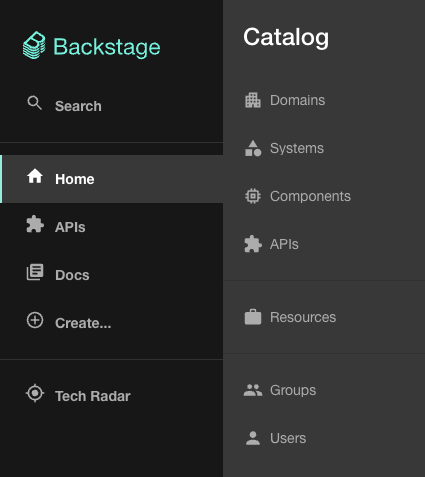
Root.tsxfile located inpackages/app/src/components/Rootas this is where the sidebar code lives 2. Then we want to add the following import foruseApp:tsx title="packages/app/src/components/Root/Root.tsx" import { useApp } from '@backstage/core-plugin-api';3. Then update the@backstage/core-componentsimport like this:tsx import { Sidebar, sidebarConfig, SidebarDivider, SidebarGroup, SidebarItem, SidebarPage, SidebarScrollWrapper, SidebarSpace, useSidebarOpenState, Link, /* highlight-add-start */ GroupIcon, SidebarSubmenu, SidebarSubmenuItem, /* highlight-add-end */ } from '@backstage/core-components';4. Finally replace<SidebarItem icon={HomeIcon} to="catalog" text="Home" />with this: ```tsx<SidebarSubmenuItem title="Domains" to="catalog?filters[kind]=domain" icon={useApp().getSystemIcon('kind')} /> <SidebarSubmenuItem title="Systems" to="catalog?filters[kind]=system" ico
启动 Backstage 应用程序后,将鼠标悬停在侧边栏的 "主页 "选项上,就会看到一个漂亮的子菜单,上面有目录中各种 "种类 "的链接。 它看起来像这样:
您可以在故事书侧栏示例
自定义主页
除了自定义主题和自定义徽标外,您还可以自定义应用程序的主页。 请阅读以下网站上的完整指南下一页.
迁移到 Material UI v5
我们现在在Backstage支持 Material UI v5。 请查看我们的迁移指南开始。